The Circus Project
Brand identity, website and website development, animation
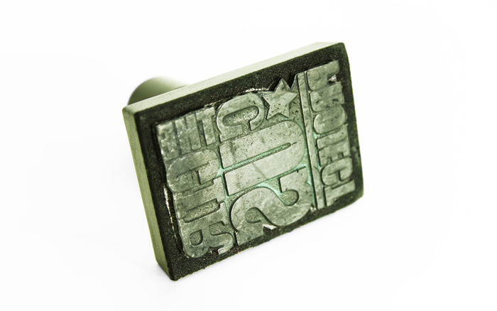
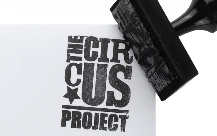
The identity had to be reproduced on a budget. The rubberstamp gave the company a raw, energetic feel.
The characters balance on top of one another working as a troop with ‘US' as the hero.
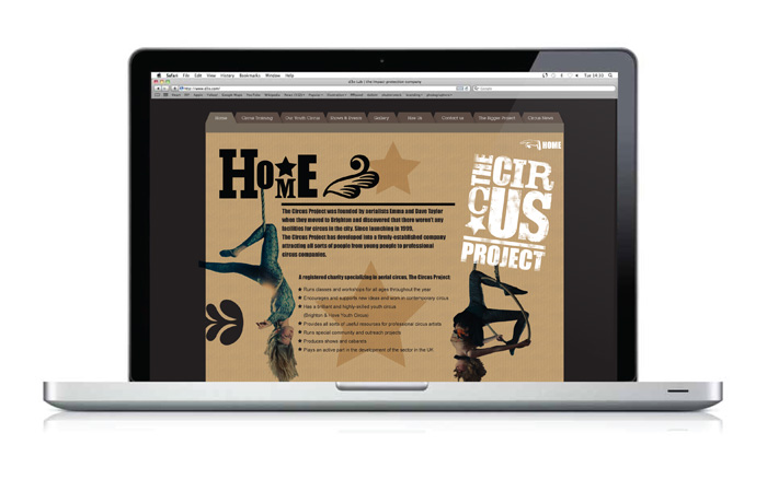
Throughout the website the typographical characters perform and support the youth circus performers.
Balancing classic circus graphics with an informative website that needed to incorporate easy to use client
updatable sections. Incorporating music and a playful typographical animation was just too irresistible.


