

Ouse Valley
Branding and packaging design.
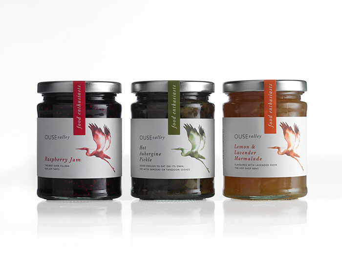
We re-branded Ouse Valley Foods, creating a distinctive logo using a beautiful comissioned watercolour illustration of a Heron from Kathy Wyatt.
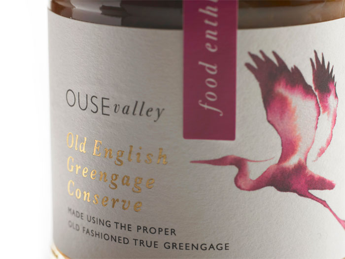
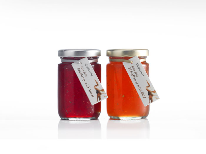
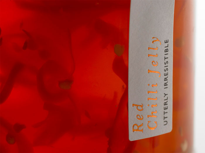
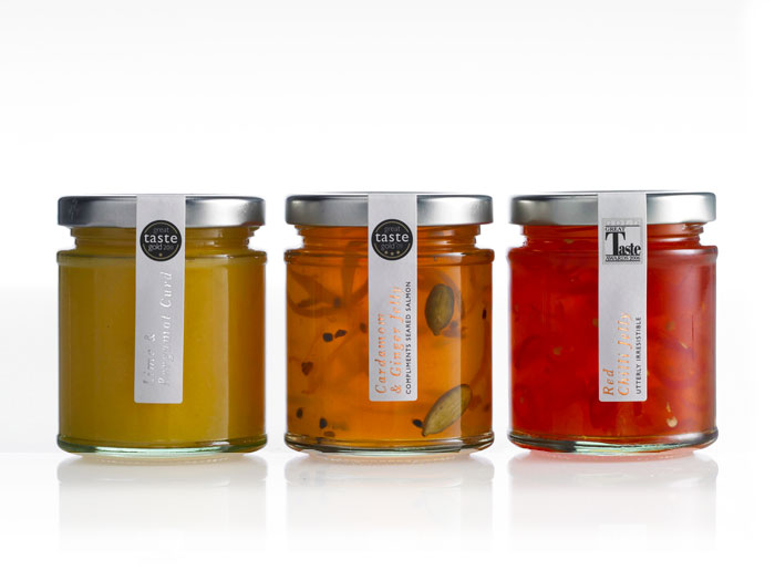
The packaging labels use a textured paper to help re-enforce the look and feel. Range differentiation was important as Ouse Valley create so many hand
crafted products and seasonal varieties.
"Although our previous design had worked very well for many years, we thought it time to refresh and enhance our look and we are absolutely thrilled with the results. The reception to our new branding has been overwhelmingly positive with our customers, who are clearly choosing our products and coming back for more! Since it’s introduction we’ve seen our sales double."
Julian Warrender